Part 2
It’s no coincidence that Burger King, Wendys, McDonalds, Coke and Pepsi all use red. Studies show that red stimulates hunger and thirst.
Amazon uses just a touch of orange to give a friendly warmth to its logo, which supports its brand message of being helpful and convenient.
Yellow is a unique color because it never gets too dark. This makes it perfect for the Yellow Pages. If you wanted to print on blue pages or red pages, you’d have to use a pastel tint of these colors to make them light enough for the print to be legible. But the yellow used on yellow pages looks crisp and bright and still makes for easy reading.
The color green exploded in use when sustainability was the big buzzword. Companies had to choose between not using green (which risks not looking eco-conscious) or using green (which risks looking like a “me too” brand.)
Most people say blue is their favorite color and informal surveys show that blue is probably the most common logo color, but I don’t think blue would be the right color for a company like Ferrari or someone hoping to compete with IBM.
Virgin Airlines wants to market themselves as being unique and luxurious in the airline industry. Purple accomplishes both of those goals.
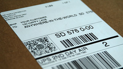
Brown is a tough color because we have some unfortunate associations with it. But it works for UPS because it relates to boxes and they use it in a way that makes it feel uniformed and buttoned up. When you have a brand attribute that’s potentially hazardous, the best thing to do is to own it, which UPS has done with their “What can brown do for you?” tagline.
Black is severe. That works in high fashion, where people want to be extreme and take what they do very seriously. It probably wouldn’t work for a company selling baby food.
Apple’s 6-color logo worked in the eighties. Its playful expressiveness set them apart from staid, conservative IBM. But in the nineties, the computer industry had changed drastically. Apple needed a new strategy and an identity that communicated it. Silver helped Apple convey their new message of “premium.”
I love talking color theory and how it can be part of a rebranding campaign. If you have any questions, send me an email. My address is below.
Matthew Wyne
Creative Director